Within the complex web that is cnn.com lives a bunch of stock market data pages that provide valuable company data and portfolio insights to users on a daily basis. On the CNN Business team, we saw a lot of opportunity here to build user value by making some much-needed improvements to these neglected, outdated pages. The catch: this was all created by a third party vendor and we didn’t have the ability to make changes on our own.
Long story short, our product team would have to rebuild ALL of our existing market data pages from scratch if we wanted to be able to iterate and create better experiences for our users. While this was a massive effort, it was a great opportunity to establish some design standards and components that could scale as the project pushed forward. As the team’s sole designer, I collaborated with our developers, product manager, data visuals team, and CNN design system team in order to make this happen.
CNN has an existing design system, called Vossi, that defines font styles, colors, grid systems, etc. to be used across the entire site. However, market data has many unique use cases that differ from the standard article and landing page components that were established for editorial content. For example, it was important to incorporate a monospaced font for live-updating numbers, as well as accessible variations of red and green to show data trends.
I worked with the Vossi team to implement these specialized design elements as needed.

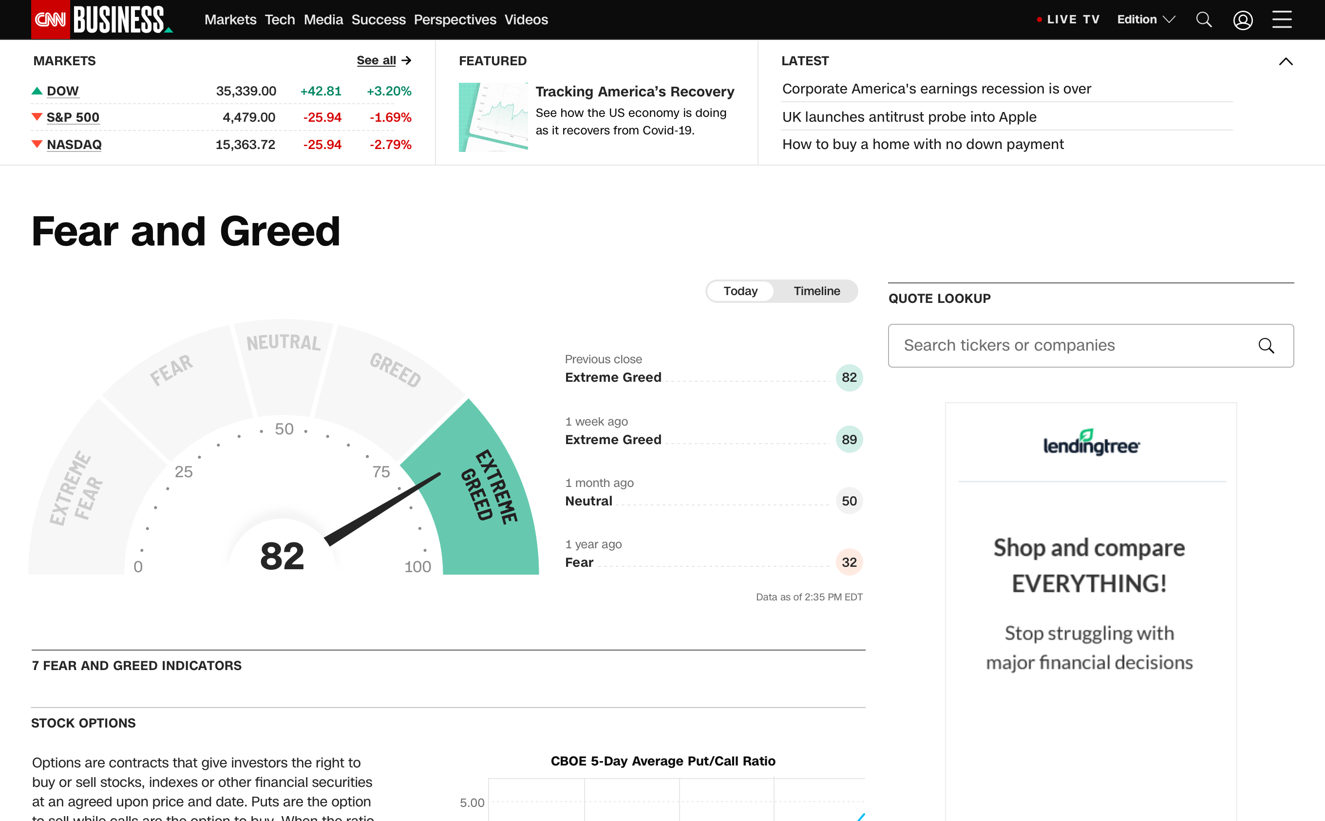
Just like font and color styles, market data components were also an addition to the already-established design system. Market pages are very data heavy, rather than editorially focused, meaning we needed to create components that would organize large amounts of complex data. Our users liked data to be dense so that they could see a lot of information on one page–so clean, polished design was critical. Here are some of the components that I created to be used across CNN Business:

Through all of the research we did for this market page migration, we learned that our users love visualized data. But in order to effectively tell stories through data visualization, we needed to establish a library of data visuals to pull from.
There were some existing–scattered and often times conflicting–data viz rules across the company, so it was a unique challenge to collaborate across teams and make decisions that work in the responsive, interactive environment. These are the charts I created after a lot of collaboration with product, development, and other visuals teams.

Data visualization has a lot of small (but extremely important) details to consider. I helped establish things like label standards, axis styles, and logic for scaling of the axes at different ranges.
I also created documentation of each chart component. An example, documentation for the area chart, is shown below.


All of these new styles and components were used on our market data pages, which gave them a more modern look, established AA accessibility standards, and fostered cohesion within the wider CNN digital ecosystem.