Overview
CNN's market data web pages were so outdated that many links and data points did not work, layouts were non-responsive, and pages were created entirely of iframes provided by our data vendor. We “owned” none of it and did not have control of the content in order to iterate and improve.
If we wanted to provide users with innovative new experiences, we needed to first build a solid foundation to work from. We manually rebuilt each component, made UX improvements, aligned with and contributed data components to the CNN design system, and spent time doing extensive user research to identify new ways to better serve our very loyal users.
(Note that a fair amount of the experience has changed, but the foundations are still there.)
My Role
• Sole Designer
• User Research
• Design Exploration
• Data Visual Design
• Design System Components
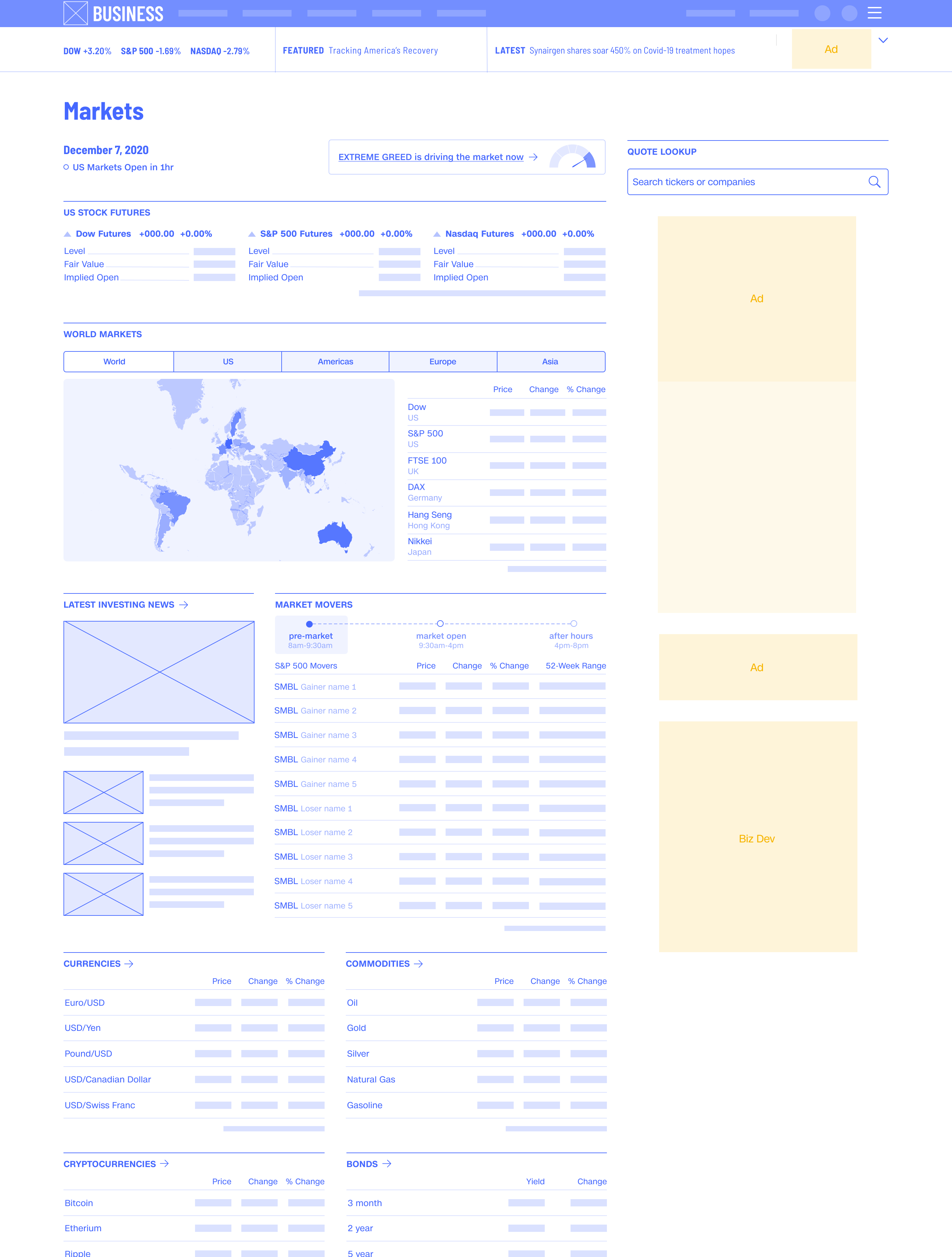
We started with one of our more popular pages, pre-market trading. This page had an average of 221K daily unique visitors, and many loyal users who returned to the page multiple times per week.
This is what the page looked like.

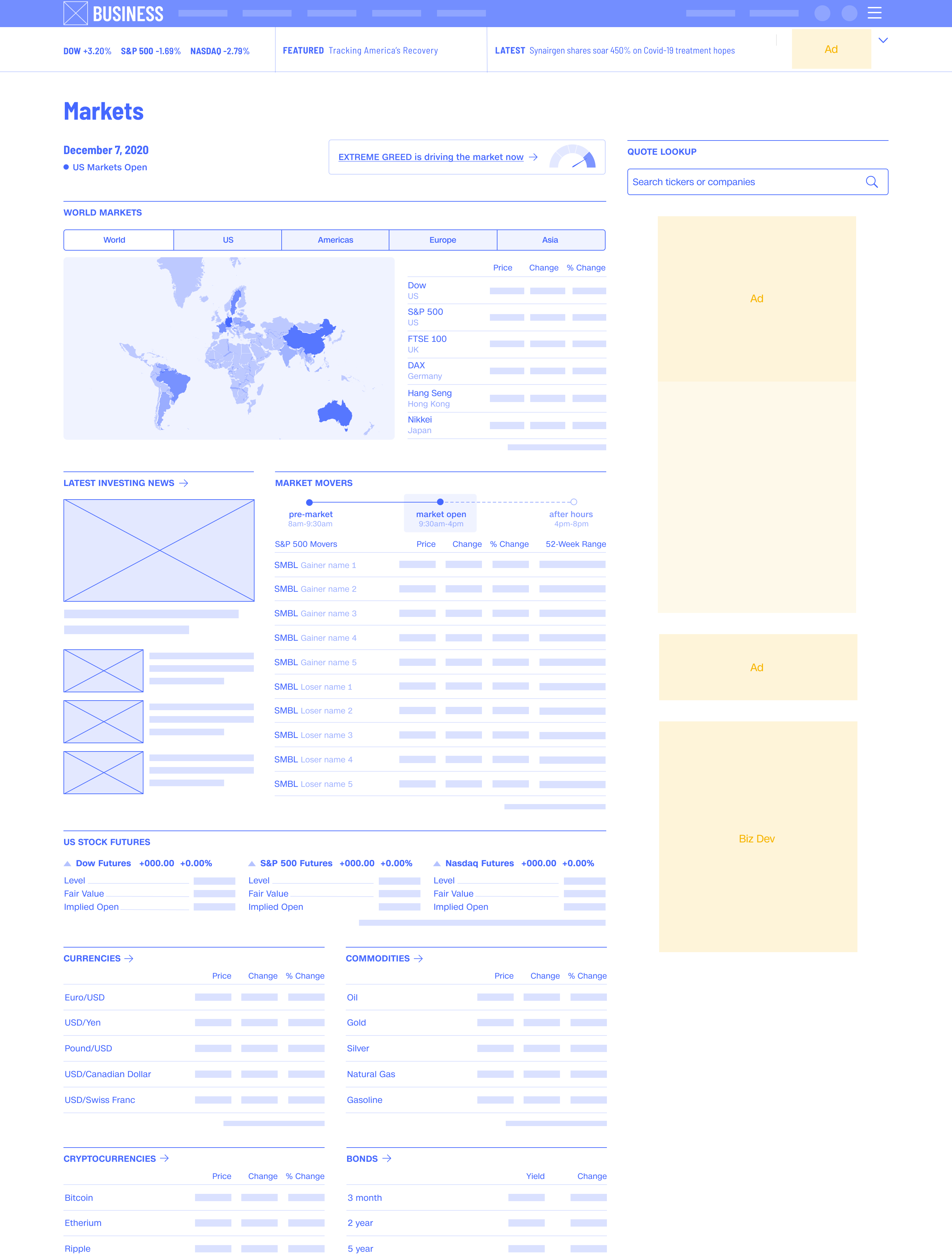
After visual design exploration and the addition of design system standards where applicable, we launched the new pre-markets experience to just 10% of our audience, with a short feedback template for users to tell us what they thought.


Because our users were so loyal and this page went unchanged for so long, this first launch received a lot of negative feedback. The overwhelming majority of users mentioned that they now had to scroll and there was too much white space, especially on mobile. They did not agree with our responsive design solution.


We moved through a series of iterations as we tweaked the page to meet user and business needs.
Some of the improvements from initial launch include:

Mobile friendly, loved by users, accessible, and aligned with the CNN Design System.
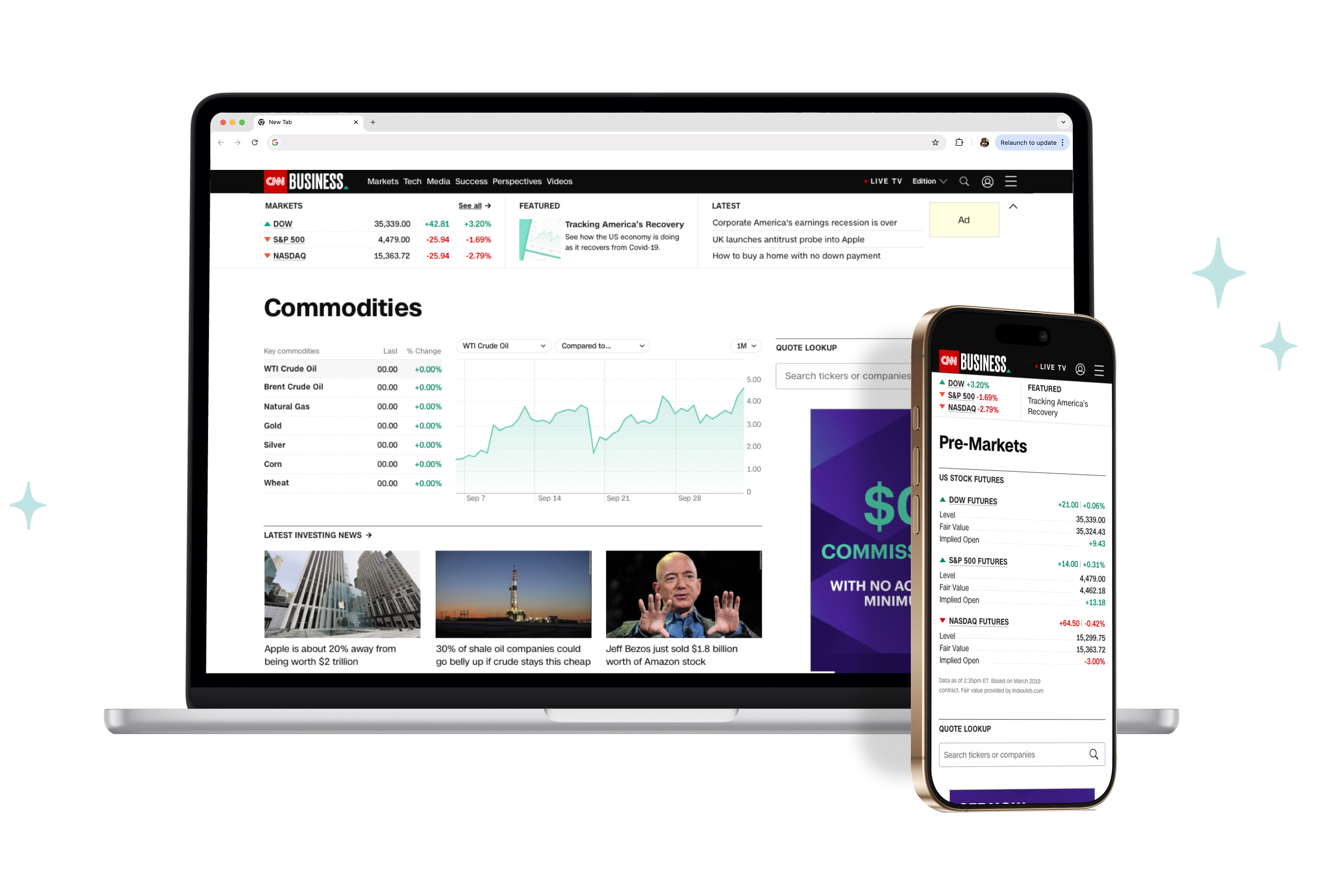
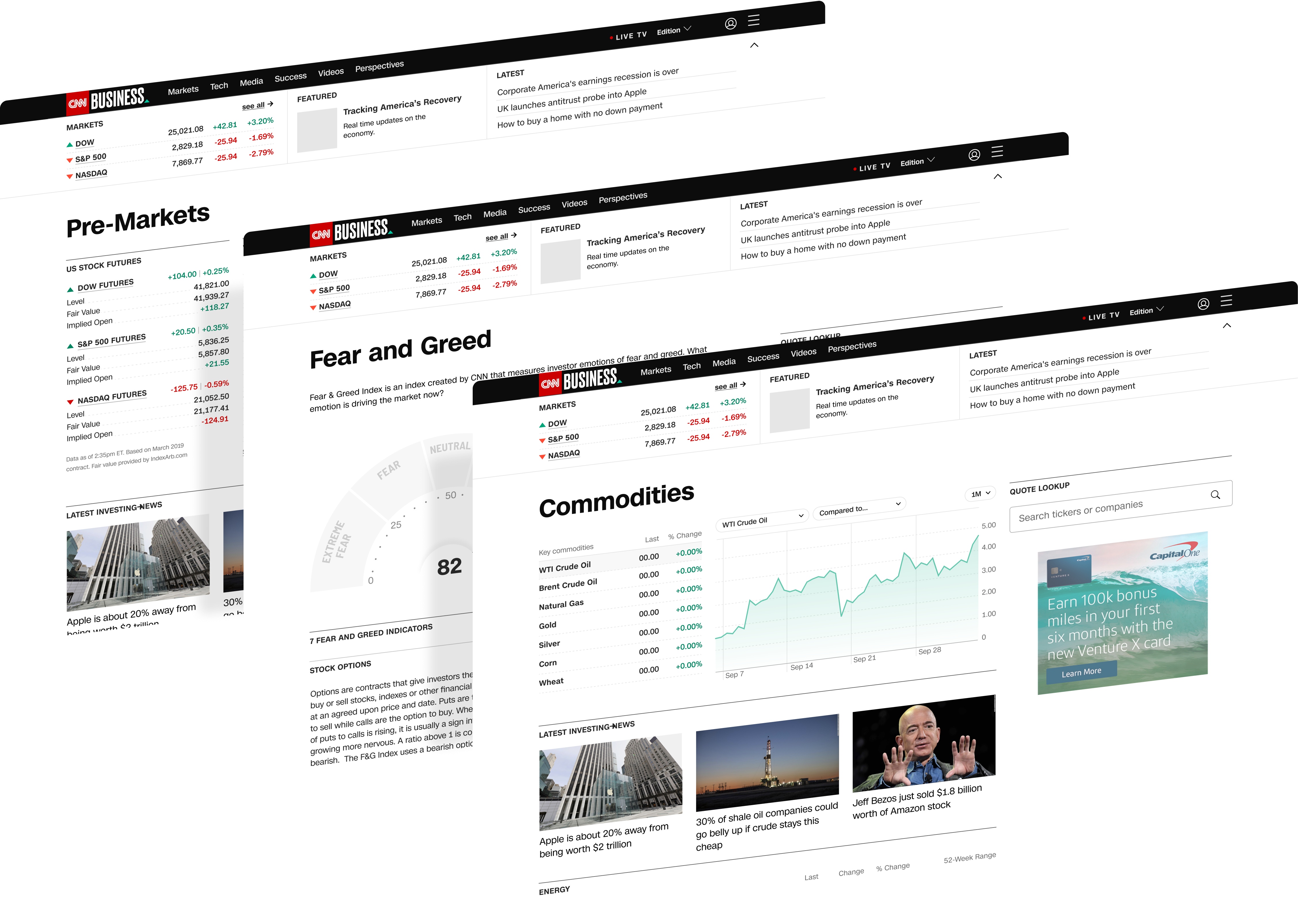
The pre-markets page was only the beginning. One by one, we applied an iterative, user-focused process to the rest of the CNN Business market data experience, launching pages that users loved and at the same time set us up for growth.
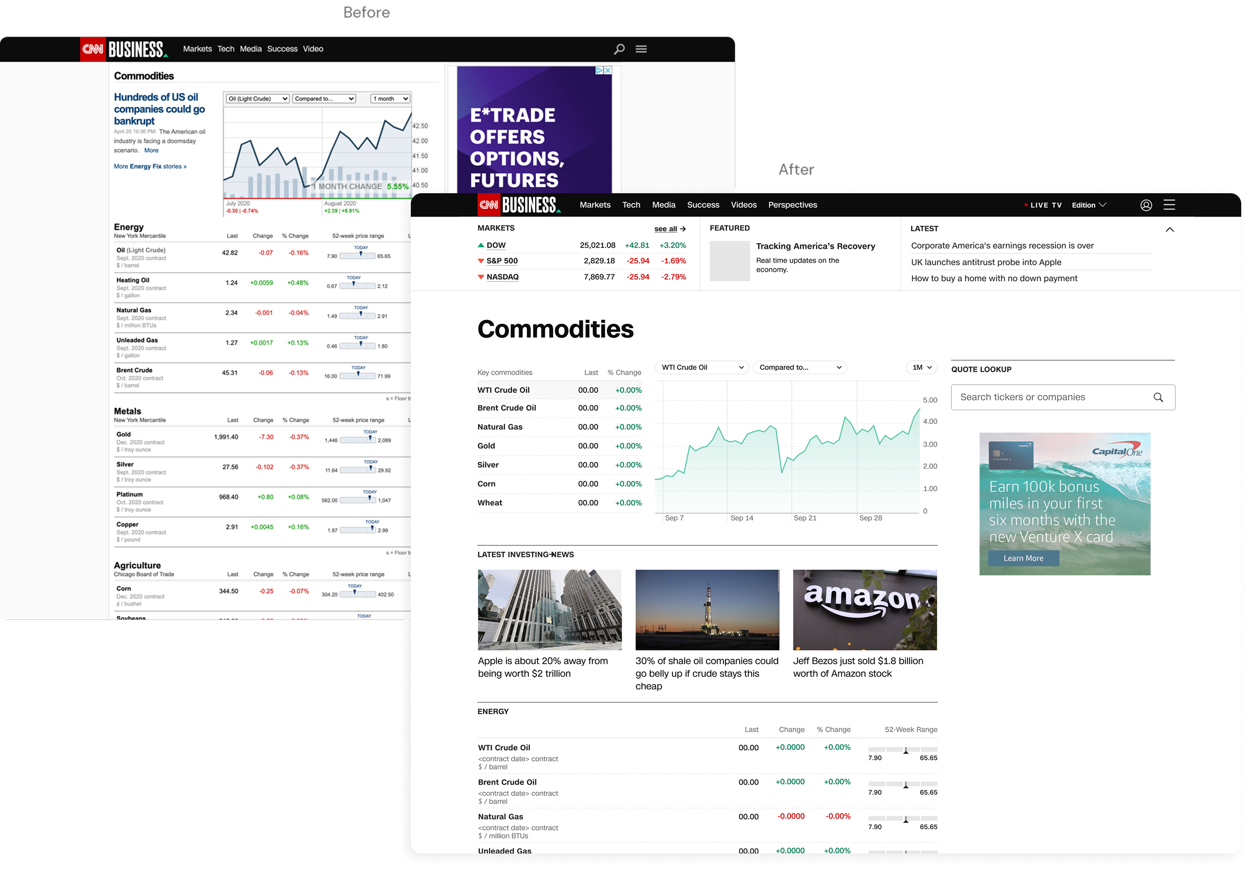
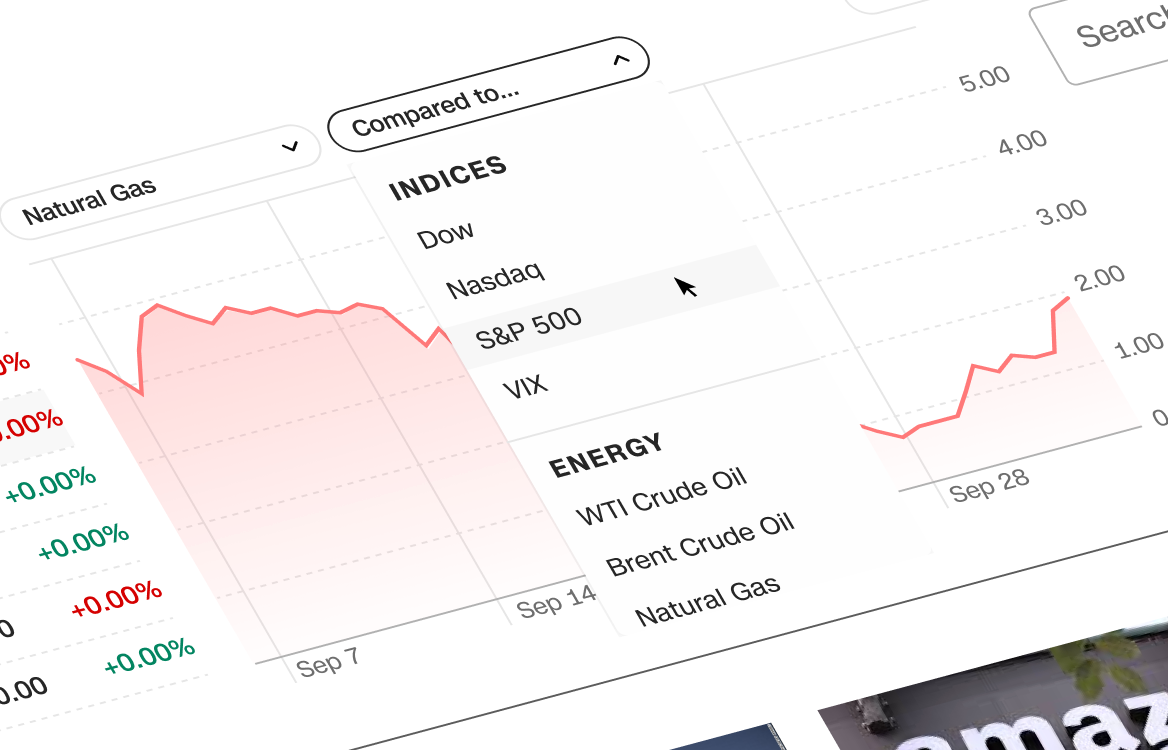
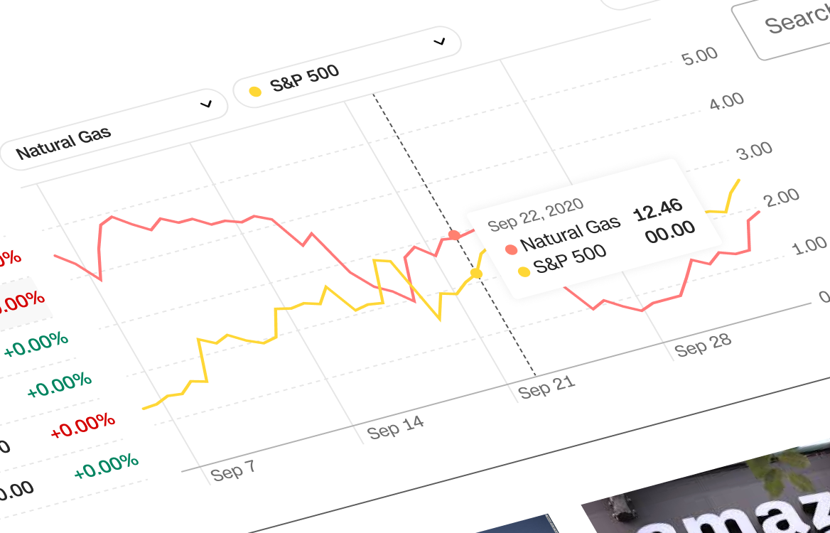
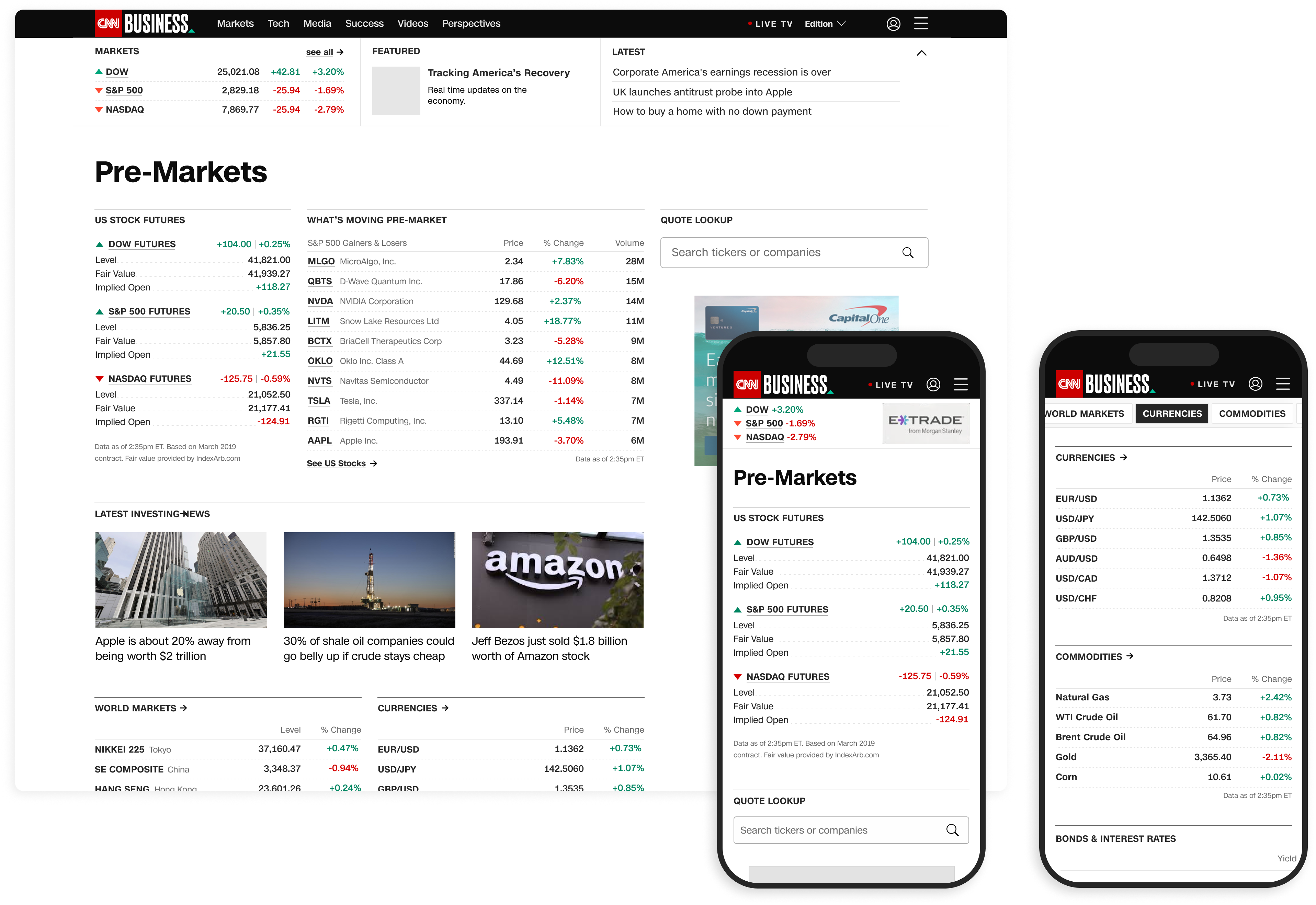
Market data pages were unique to the CNN Design System. There was a need for our components to cleanly organize large amounts of complex data–unlike the other editorial focused pages. These are the individual components that I designed and worked with the wider CNN Design System team to integrate:

I designed this data visual library through close collaboration with product, development, and our editorial visuals team. It was a unique challenge to make decisions and set rules for both the editorial experience as well as the responsive, interactive environment.


I envisioned a future where we did not host multiple data pages, but rather had one main hub where all of the key information would live at once. The idea is that this page would be dynamic and layout would restructure to serve the most relevant information depending on whether markets were open or closed.
I departed the company prior to delivering any final designs, but this concept is live on the CNN site today.